
Plaid Redesign
Plaid is a fintech company that deals with the communication between financial service apps, user's banks, and credit card providers. Many consumer-facing apps use APIs from companies like Plaid, making it imperative for the user experience to be seamless.
Plaid has created a portal where users can view which financial institutions and apps are linked within the Plaid database. Bringing forth this information for users provides a sense of security because they can manage and edit where they would like their information to be shared.
The information in this case study is my own and does not reflect the views of Plaid. For more info go to Plaid.com

Details
1. Show accounts
The first thing that stood out to me in the portal was the accounts tab, which shows the user the bank accounts or credit card holders that Plaid is using to pull data from.
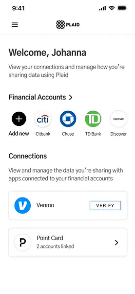
When most users see plaid in other applications they are completing a single action; linking their bank account. When coming into the Plaid portal I felt it was important to show this information. Instead of having an additional tab for accounts, I redesigned the Financial accounts to be front and center.
2. Adding accounts
In addition to bringing forward the user's financial accounts, I wanted to provide an action that a user could take in order to "set up" or "complete" their plaid portal. I brought forward the CTA, allowing users to add a new financial account.
The logos of the fianancial accounts were designed as a horizontal carousel which provided some color to the page without overwhelming the user with too much text.
3. Connected apps
After reading the descriptions of "Matched Accounts" and "Connections" it seemed that both of these sections were prompting the user to do the same thing; verify their account.
I decided to collapse the sections into one section called "Connections". Because the user has to verify information in both instances, in matched accounts and connections, the information should live together,
4. Clear terminology
Another reason for removing matched accounts was to help clarify the difference between financial accounts and app accounts.
By calling app accounts "connections" and financial accounts "accounts" there is more clarity to how plaid communicates. In the connections sections users can see the number of accounts linked to a particular app.